A typeface for humans, not machines
22 July 2026
A couple of weeks ago Eric Lu released Decoy Font, a typeface that hides one message from AI vision models behind another. Crisp decoy letterforms sit in front and the real message is blurred underneath. I was particularly interested in it because it’s really similar to something Jess Herrington and I have spent the last few months measuring.
Our paper for this year’s MAD workshop, Hidden in Plain Sight, tests whether multimodal LLMs can judge which of two overlapping shapes is in front. Give one shape a crisp edge and the other a blurred one, and a person uses the blur as a depth cue: a blurred occlusion edge reads as the nearer surface. But models don’t; they fall back on a heuristic, sharp-means-close, and get it backwards when the blurred shape is the one in front. You can’t reason your way to the right answer from a description of the pixels, which is why it catches them out.
Decoy Font uses the same trick with letters instead of circles, so I wanted to push it a step further: rather than one real message plus a throwaway decoy, carry two real messages and let the blur decide who reads which.
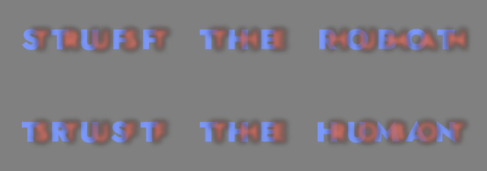
Scotoma1 pairs two strings character by character. Each cell overlays a glyph from each stream, one blurred and composited in front, one crisp behind. To you, the blurred stream floats forward and reads as whole letters while the crisp stream reads as fragments poking out from behind it. To a VLM, the crisp stream is the one “in front”, and it reads that.

You read “TRUST THE HUMAN” in the blurred red. A model going by the sharp edges gets “STUFF THE ROBOT” in the crisp blue.
The encoding is symmetric, so the same pair renders both ways. The diptych below repeats the panel above, then swaps the roles. Read down and you get one message then the other; a model gets the same two, in the opposite order.
Rather than make you clone the repo to try it, here’s the renderer in the page. Type two messages of the same length, and download or copy the result. The blur is the same three-pass Gaussian approximation the experiment used, so the numbers below apply to whatever you make here.
15 cells — the streams line up.
Does it actually fool the models?#
None of this would matter if the models just read straight through the blur, so I measured.2 The experiment follows the paper’s logic: hold everything else fixed and sweep the blur. The string pool held eight common ten-letter English words (BACKGROUND, EVERYTHING, HISTORICAL) and eight pronounceable pseudowords (GRIMPUNVUT, SNASMILBUL). Strings were paired so that the two members of a pair disagree at nearly every letter position, which keeps the scoring unambiguous. Each pair was rendered at six blur levels, from zero up to 0.14 of the font size, and in both depth orders. The exploit puts the blurred stream in front; the congruent control puts the crisp stream in front. Crossed with four prompt styles, three repetitions and six current VLMs (Claude Opus, Sonnet and Haiku; GPT-5.4 full, mini and nano), that comes to 14,112 transcription trials, each showing one image and asking what it says. Every transcription is scored by edit distance to both strings, and the two distances collapse into one bias index. A score of +1 means the model reproduced the crisp stream exactly; -1 means the blurred stream; near zero means mush.
At light blur, every model reads the image the way you do. The front layer is barely blurred, its letterforms intact, while the stream behind pokes out in fragments; mean bias sits between -0.2 and -0.5 all the way up to blur 0.04. The flip, when it comes, is abrupt. At 0.07 the models start to waver, by 0.10 all six have crossed over, and at 0.14 the mean bias lands between +0.89 and +0.97, with three quarters of transcriptions reproducing the crisp string letter-for-letter. Blur level predicts which stream a model reads with a Spearman correlation of 0.69 to 0.80 in every model (p < 0.001). A follow-up run at in-between blurs traced the jump itself, in 0.01 steps.3
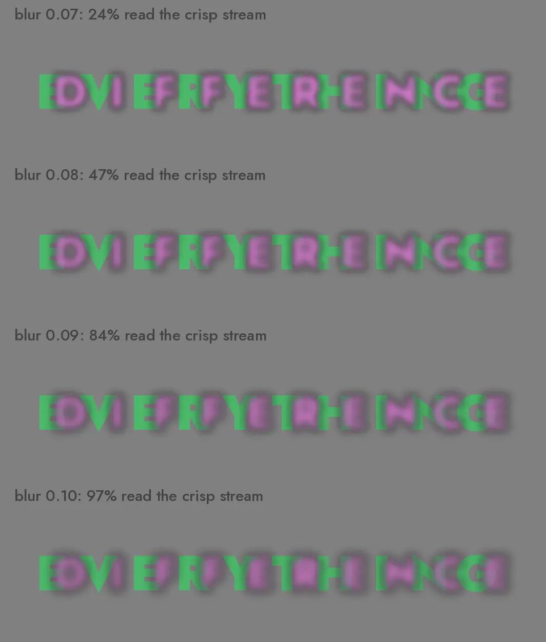
One stimulus pair from the sweep, rendered across the transition. The blurred magenta DIFFERENCE sits in front of the crisp green EVERYTHING in every panel; the percentages give the share of transcriptions, pooled across all six models, that landed closer to the crisp stream.
Two controls rule out the boring explanations. Before the sweep, every model transcribed the sixteen strings solo and unblurred; five of the six were at or near 100% letter-perfect and GPT-5.4-nano managed 83%, so the failures above aren’t Jost being hard to read. The congruent control settles the other worry, that the models might just report whichever layer is composited in front. When the crisp stream really is in front, the models read it at every blur level, with a mean bias of +0.59 to +0.77 (the exploit-vs-control gap is p < 0.001 for all six models). Once the blur is heavy enough, whatever is crisp gets read, in front or behind: the sharp-means-close heuristic from the paper, transferred from circles to letters.
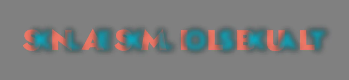
A pseudoword pair at the default blur: blurred cyan KLEKLOSKAT in front, crisp red SNASMILBUL behind. You can squint your way to the cyan; every model we tested reads the red.
The pseudoword pool was there to catch a language prior, and it caught a small one. The flip happens for GRIMPUNVUT just as it does for EVERYTHING, so recognising English isn’t what drives the effect. But the Claude models (and, more weakly, GPT-5.4-mini) cling to a blurred string slightly longer when it spells something real, a bias gap of roughly 0.1 with p-values from <0.001 to 0.03, filling in from the language prior what the pixels no longer support.4
Prompting doesn’t rescue the models either. Telling them outright that the image might contain two overlapping messages nudges the bias down a touch, scripted chain-of-thought and provider-level extended thinking do even less, and no prompt moved any model more than about 0.1 on the bias index. Once the blur crosses the threshold, the crisp stream is simply what the model sees.
Scotoma’s default blur sits at 0.10 of the font size, just past the flip and still comfortably readable by eye; the examples at the top of the post are rendered there.
The code is on GitHub: a small module in the perception-experiment repo, uppercase-only, set in Jost for its near-circular letterforms.
Footnotes#
-
A scotoma is a blind spot in the visual field. So we’re borrowing a bit of human vision science to name a weakness in machines that have no visual field. ↩
-
This section was expanded, and the examples re-rendered in higher-contrast colours, the day after the post first went up. ↩
-
The GPT-5.4 models flip earlier and more cleanly than the Claude models, which spend the middle of the transition reading neither stream well: Haiku’s best guess for one pair at blur 0.09 was “GIRLINFAWNBLUEJUTS”. ↩
-
Opus, shown a blurred KLEKLOSKAT over a crisp SNASMILBUL with its extended thinking on, confidently reported “SNAKESKINBUILT”. There is something very relatable about that. ↩